Various parameters exist which allow the Geoscientist to perturb how the operator is generated. In this application these changes occur in real time so you will be able to see immediately the effect of the change you have made. Pop up the "Design Controls" dialog by either clicking the menu item under the menu bar or by clicking the  icon.
icon.
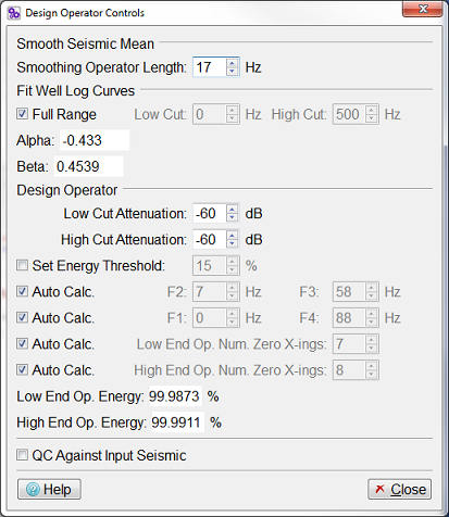
The figure above shows the Design Controls dialog. This dialog allows the various parameters that control the operator to be varied. The steps below give you a brief overview of the parameters found on the Design Controls dialog.
Smoothing Seismic Mean
This controls the amount of smoothing that will be applied to the seismic mean spectra. The operator length is specified in Hertz.
Fit Well Log Curves
These spinboxes control the lower and upper boundaries for the principal curve fit. Outside this range the curve is, by default, extrapolated on the lower end and forced to be horizontal on the upper end (with smoothing applied in the vicinity of the boundary). Other curve fitting controls are available via the
 icon or Frequency Domain Advanced Controls... menu item.
The field Alpha displays the value of the low frequencies curve fitting parameter which can be changed on the "Advanced Controls" dialog.
The field Beta displays the value of the high frequencies curve fitting parameter which can be changed on the "Advanced Controls" dialog.
Design Operator
The Attenuation spinbox allows your to control the filter attenuation value in dBs. By default it is set to -60 dBs.
The Set Energy Threshold: The checkbox controls whether the operators are designed in terms of percentage of energy captured or based on the filter frequencies specified below as F1 to F4.
By default the low (F1 and F4) and high (F2 and F3) cut points are automatically determined. You can override these settings manually by unchecking the checkboxes to the left of the and spinboxes, respectively. This will sensitise the spinboxes allowing you to set the lower and upper cuts of the derived operators.
The next control relates to the low end and high end operator lengths, which by default is automatically determined. The operator lengths are designed to capture over 99.9% of the energy and are truncated to the nearest zero crossing. You can override this default by unchecking the checkboxes to the left of the respective spinboxes.
Finally, a facility is provided to automatically QC the derived operators. This is achieved by applying the operators to the alternative set of random traces from the same seismic data volume and charting the derived residual operators in the "Low - Residual Operator (QC)" and "High - Residual Operator (QC)" charts. We are looking for the residual operators to be centred around zero and essentially flat. By perturbing the F1 to F4 spinboxes within the "Design Operator" group, you can usually maximise the bandwidth in such a manner without significant residual correction either end.
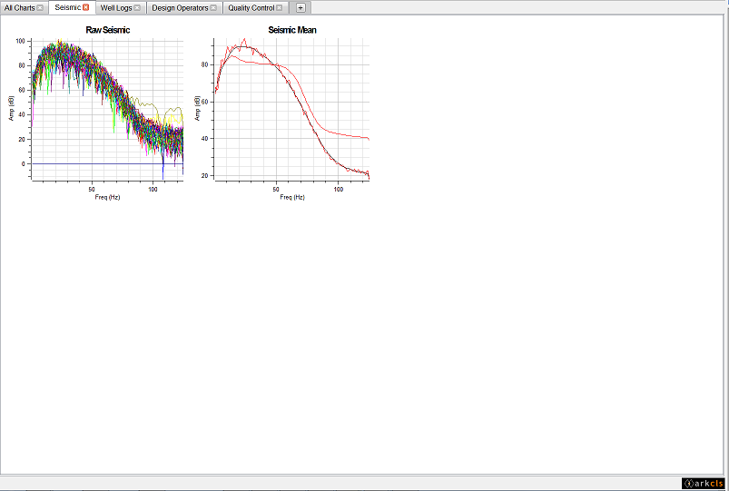
The figure above shows a typical Frequency Shaping main window with the Seismic charts tab selected. The following gives a brief description of each of the charts displayed on each tab using the supplied default template (moving left to right and top to bottom)
Raw Seismic
This chart displays the spectra for each of the random set of seismic traces loaded in the main set used in the analysis and design of the Broadband operator.
Seismic Mean
This chart displays the mean spectrum (red) of all the raw spectra. It also displays the smoothed mean spectrum (black). The smooth mean spectrum is used to derive the Low and High end operators.
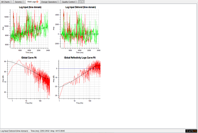
The figure above shows a typical Frequency Shaping main window with the Well Logs charts tab selected. The following gives a brief description of each of the charts displayed on each tab using the supplied default template (moving left to right and top to bottom)
Log Input (time domain)
This chart displays the well impedance logs in time domain. In this case there is only one impedance log but typically there are more. Also displayed on this chart is the trend line (black).
Log Input Detrend (time domain)
This chart displays the well impedance logs with the trend removed. Note that the ramp has also been applied at the end of the impedance log. Detrending and ramping are designed to remove the possibility of artifacts being introduced in the Fast Fourier Transform (FFT) process.
Global Curve Fit
This chart displays the mean spectrum of all the well log impedance spectra. On this chart the x axis is displayed using a logarithmic scale. Also displayed is a curve fit spectrum (black). The band limited version of this curve fit spectrum is used to derive the Low End operator.
Global Reflectivity Logs Curve Fit
This chart displays the mean spectrum of all the reflection coefficients spectra. On this chart, the x axis is displayed using a logarithmic scale. Also displayed is a curve fit spectrum (black). The band limited version of this curve fit spectrum is used to derive the High End operator.
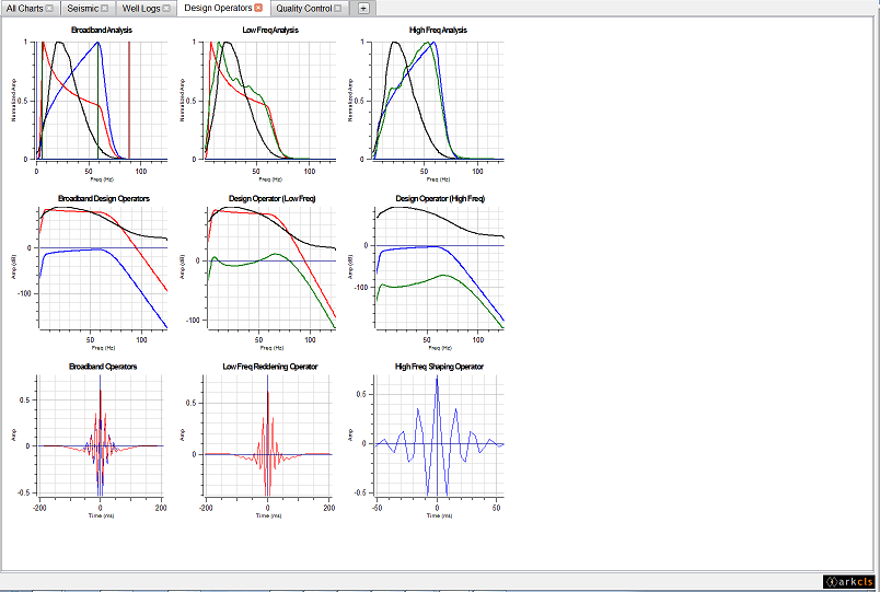
The figure above shows a typical Frequency Shaping main window with the Design Operators charts tab selected. The following gives a brief description of each of the charts displayed on each tab using the supplied default template (moving left to right and top to bottom)
Broadband Analysis
This chart displays a normalized amplitude spectrum of:
- Smooth average input seismic in black;
- Band-limited spectrum derived from the smooth composite curve fit to the average AI spectrum in red;
- Band-limited spectrum derived from the smooth composite curve fit to the average AI reflectivity spectrum in blue;
- The vertical lines represent frequency corner F1 to F4 to define the Redding and Shaping operators;
- The horizontal dark cyan is the -60 dBs Attenuation that defines F1 and F4.
This chart helps define F1 to F4 owing to the normalised scale that allows direct comparison between low and high frequency composite curves against smoothed average input seismic.
Low Freq. Analysis
This chart displays a normalised amplitude spectrum of:
- Smooth average input seismic in black;
- Band-limited spectrum derived from the smooth composite curve fit to the average AI spectrum in red;
- Smooth mean of seismic after applying Low Frequency Operator in green;
- The horizontal dark cyan is the -60 dBs Attenuation that defines F1 and F4.
This low frequency part of the broandband analysis chart includes the smoothed average spectrum of the seismic resulting from the convolution of the input seismic and reddening operator.
High Freq. Analysis
This chart displays a normalised amplitude spectrum of:
- Smooth average input seismic in black;
- Band-limited spectrum derived from the smooth composite curve fit to the average AI reflectivity spectrum in blue;
- Smooth mean of seismic after applying High Frequency Operator in green;
- The horizontal dark cyan is the -60 dBs Attenuation that defines F1 and F4.
This high frequency part of the broandband analysis chart includes the smoothed average spectrum of the seismic resulting from the convolution of the input seismic and shaping operator.
Broadband Design Operators
This chart displays an amplitude spectrum (in dBs) of:
- Smooth average input seismic in black;
- Band-limited spectrum derived from the smooth composite curve fit to the average AI spectrum in red;
- Band-limited spectrum derived from the smooth composite curve fit to the average AI reflectivity spectrum in blue.
This low frequency part of the broandband analysis chart includes the smoothed average spectrum of the seismic resulting from the convolution of the input seismic and reddening operator.
Design Operator (Low Freq.)
This chart displays an amplitude spectrum (in dBs) of:
- Smooth average input seismic in black;
- Band-limited spectrum derived from the smooth composite curve fit to the average AI spectrum in red. IE. the desired output from the Low Frequency;
- In green, the difference between black and red curves, this will be the amplitude spectrum of the Low Frequency Operator;
Comparison, using a dBs scale, of the smoothed average input seismic and desired output for the low frequency part of the broadband process.
Design Operator (High Freq.)
This chart displays a normalised amplitude spectrum of:
- Smooth average input seismic in black;
- Band-limited spectrum derived from the smooth composite curve fit to the average AI reflectivity spectrum in blue. IE the desired output from the High Frequency;
- Amplitude spectrum of the High Frequency Operator (green), the difference between black and blue curves.
Comparison using a dBs scale of the smoothed average input seismic and desired output for the high frequency part of the broadband process.
Broadband Operators
This chart displays both the low end and high end operators on the time domain:
- Low Frequency operator shape in red;
- High Frequency operator shape in blue.
Various controls in the "Select Input Data" dialog, "Design Operator" dialog and "Advanced Controls" dialog can have an immediate effect on this chart.
Low Freq. Reddening Operator
This chart displays the low frequency operator in the time domain. Various controls in the "Select Input Data" dialog, "Design Operator" dialog and "Advanced Controls" dialog can have an immediate effect on this chart.
High Freq. Shaping Operator
This chart displays the high frequency operator on the time domain. Various controls in the "Select Input Data" dialog, "Design Operator" dialog and "Advanced Controls" dialog can have an immediate effect on this chart.
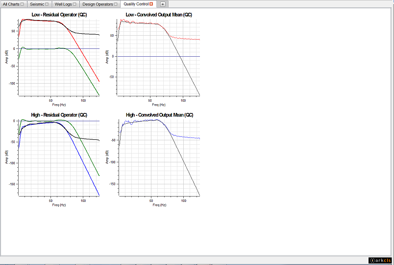
The figure above shows a typical Frequency Shaping main window with the Quality Control charts tab selected. The following gives a brief description of each of the charts displayed on each tab using the supplied default template (moving left to right and top to bottom)
Low - Residual Operator (QC)
This chart displays an amplitude spectrum (in dBs) for:
- Smooth average for low frequency data in black;
- Band-limited curve fit to global AI spectrum in red;
- Residual Operator (difference between red and black curves) is in dark green. A good fitting between smooth mean and band-limited will show values close to zero over F1 to F4 range.
Low - Convolved Output Mean (QC)
This chart displays an amplitude spectrum (in dBs) for:
- Average for low frequency data in red. Amplitude spectrum of convolved traces but without smoothing;
- Band-limited curve fit to global AI spectrum in black.
High - Residual Operator (QC)
This chart displays an amplitude spectrum (in dBs) for:
- Smooth average for low frequency data in black;
- Band-limited curve fit to global AI reflectivity spectrum in blue;
- Residual Operator (difference between red and black curves) is in dark green. A good fitting between smooth mean and band-limited will show values close to zero over F1 to F4 range.
High - Convolved Output Mean (QC)
This chart displays an amplitude spectrum (in dBs) for:
- Average for high frequency data in red. Amplitude spectrum of convolved traces but without smoothing;
- Band-limited curve fit to global AI reflectivity spectrum in black.