SnpQt provides various mechanisms to allow you to interact with the main window chart area. These interactions can be:
Global - The interaction effects the whole chart area (eg global zooming)
Chart level - The interaction effects an individual chart (eg change title of chart)
Data object level - The interaction effect an individual data curve on the chart (eg set up plot rule)
Some of these interactions can be achieved directly on the chart area whereas other interactions require you to first pop up a dialog.
Direct interactions with the chart area allow you to interact with the chart without popping up additional dialogs
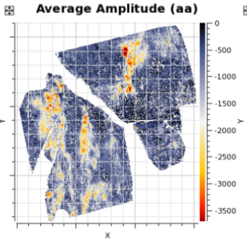
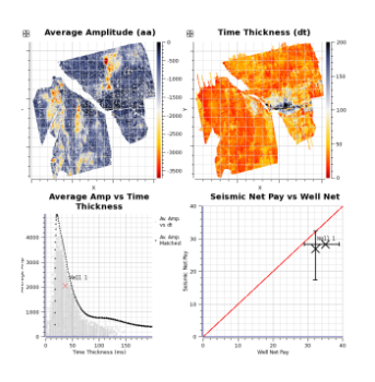
Global zooming allows you to zoom the chart area in or out with the mouse.
 .....
.....
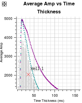
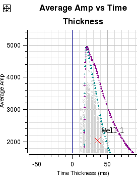
The images in the figure above show how the central chart area can be zoomed in and zoomed out in a global sense.
Zooming in is achieved by either clicking on the menu item View->Zoom In or clicking the  icon. The left image shows the result on the charts of zooming in.
Zooming out is achieved by either clicking on the menu item View->Zoom Out or clicking the  icon. The right image shows the result on the charts of zooming out.
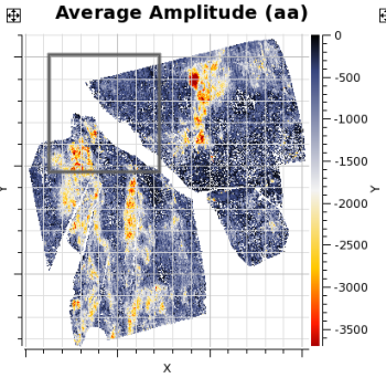
Data zooming is different from global zooming as data zooming is only performed on an individual chart. Like global zooming it is quick and easy. Charts zoomed in this way stay zoomed until you revert them to an unzoomed state. You can zoom in and out on individual charts by pressing and holding the Control key then rotate the mouse wheel either towards you (zoom out) or away from you (zoom in). The zooming will be centred around the position of the mouse. Alternative methods for individual chart zooming are described below.
 .....
.....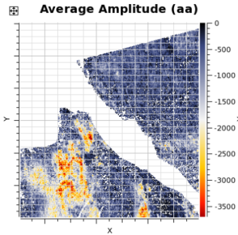
The images in the figure above show how data on an individual chart can be zoomed. Data zooming is the process of identifying a data area within a given chart and arranging the chart axis so that area fills the chart.
Data zooming is achieved by dragging a rectangular box (rubber band) over an area of the data on one of the charts that is to be zoomed. You invoke data zooming mode by pointing to the chart that is to be zoomed and pressing MB3. This pops up a menu. Select "Zoom Data (Shift MB1)" will put you in data zooming mode. Now pressing and holding MB1 and dragging will allow you to rubber band the area on the chart that is to be data zoomed. Letting go the MB1 will instantly data zoom the chart. After data zooming the MB1 will revert to its default mode "Identify Data". To unzoom the data press MB3 to pop up menu and select "Unzoom/Recentre Data (Shift MB1). Another faster method of achieving the same result is to press and hold the Shift key whilst sweeping out a rectangle by pressing and holding MB1 and dragging over the area that is to be data zoomed. To unzoom simply hold down Shift key and press and release MB1 on the chart. If you have zoomed in multiple times, this action will unzoom in steps. Pressing MB2 on the chart will also unzoom in steps. Note the ![]() icon which unzooms all and recentres the data in one go. This can also be achieved by MB3 clicking and selecting the "Unzoom All/Recentre Data" pull down menu item.
icon which unzooms all and recentres the data in one go. This can also be achieved by MB3 clicking and selecting the "Unzoom All/Recentre Data" pull down menu item.
The left image shows the rubber band box identifying the area that is to be zoomed and the right image shows the result of the data zoom.
Moving data is a mechanism which allows you to grab hold of the data on a chart and drag it to a new position. Essentially you are changing the axes on the chart coordinate system.
 .....
.....
The images in the figure above show how data on an individual chart can be moved.
Moving data is achieved by pointing to a position on a chart and moving that position to a new place. You invoke move data mode by pointing to the chart where you have data that is to be moved and click MB3. This pops up a menu. Select "Move Data (Ctrl MB1)" which will put you into move data mode. The next time you click and hold with MB1 on the chart the position to be moved will be identified. Whilst holding down MB1 move to the new position. Data will move interactively as you move to the new position. Letting go the MB1 will leave the data at the new position. After data moving the MB1 will revert to its default mode "Identify Data". To re-centre the data press MB3 which will pop up a menu then select "Unzoom/Recentre Data (Shift MB1). A faster method of achieving the same result is to press and hold Ctrl key then press and hold MB1 whilst dragging the data to the new position.
The left image shows the old position of the data with the image showing the new position of the data.
It is sometimes useful to see axes displayed differently. This is easily achieved via a pop up menu. Clicking MB3 on a chart will cause the pop up menu to be displayed. The menu will show, amongst other options, a cascade menu for X Axis and Y Axis.
The cascade menu for the X Axis allows you to toggle between:
Linear Scale or Logarithmic Scale (Series Data charts only)
Increasing Right or Increasing Left (Series Data charts only)
Axis at Bottom or Axis at Top
Axis Scale On or Off
Axis Title On or Off
The cascade menu for the Y Axis allows you to toggle between:
Linear Scale or Logarithmic Scale (Series Data charts only)
Increasing Up or Increasing Down (Series Data charts only)
Axis Scale On or Off
Axis Title On or Off
By pressing and holding MB3 whilst hovering over the y axis or x axis or the data area of the chart, you can pop up a menu. In this case the user clicked over the x axis. Moving to the X Axis item on the pop up menu will cause the X Axis cascade menu to be displayed. Then, moving to the right over the cascade menu item and releasing MB3 will cause the chart to be redrawn with the Axis Scale turned on. If the process is repeated the option has changed to . Selecting this will now turn off the Axis Scale.
Other changes to the X and Y axes or chart data can be performed in a similar manner.
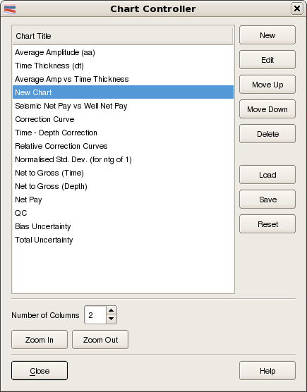
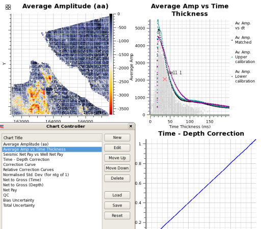
The Chart Controller dialog allows you to change various properties of a chart. The Chart Controller will also allow you to create new charts, delete charts, edit charts, control layout (number of columns) and change the order of the charts within the chart area. A useful feature is that the current chart configuration can be saved to a XML file. Subsequently the XML file containing the chart configuration can be loaded to the current session. Chart configuration XML files do not save data or SnpQt parameters so can be readily used in other projects or sessions. The Chart Controller dialog can be popped up by clicking menu item or clicking the  icon. The figure below shows the Chart Controller. Changes made via the Chart Controller are immediately updated on the Chart Area of the Main Window.
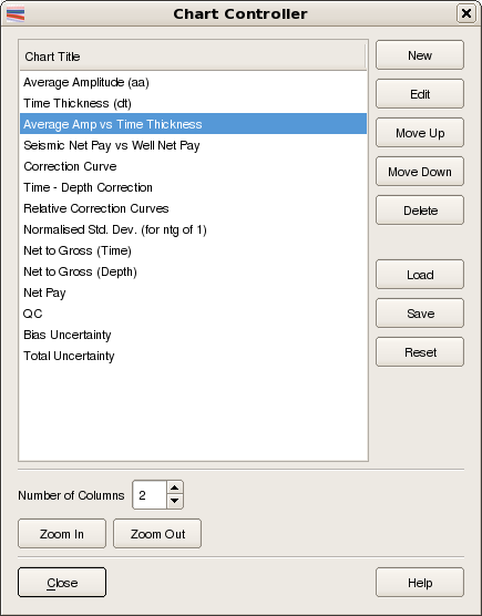
The sub-sections below outline the various tasks that can be performed from within the Chart Controller.
Creating a new empty chart is a very simple process. The table below shows an example of how this is achieved.
 .....
.....
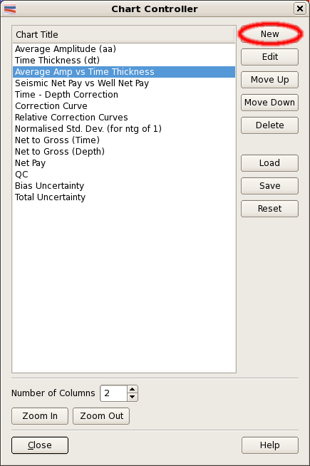
The two images in the figure above show how a new chart can be created.
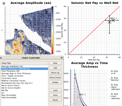
With the Chart Controller dialog displayed, select an existing chart from the list of available charts. The selected chart will be highlighted (reverse video). Now, click the push button (first image) which will cause a new empty chart to be inserted immediately below your currently selected chart (ie below the "Average Amp vs Time Thickness" chart in this case). Note in the chart area of the main window, charts are arranged in rows. So, in a two column arrangement the first chart will appear in row 1 column 1, the second chart appearing in row 1 column 2 and third chart in row 2 column 1 and so on. In the Chart Title list the new chart named "New Chart", will become the currently selected chart and will be highlighted. The main window will also be updated to show the new empty chart.
To change the name of the new chart, simply click on the text "New Chart" within the Chart Controller dialog and type the new name you require. For example, we could changed the name from "New Chart" to "Depth Thickness". The Main Window will be updated as soon as you press "Return" or "Enter" or by clicking away from the just edited chart name in the list. You can change the name, at any time, of any of the charts in the list.
When a new chart is created it is normal to label the axes and to select the Data Items to be displayed in the chart. You can achieve this by clicking the push button to pop up the Display Options dialog.
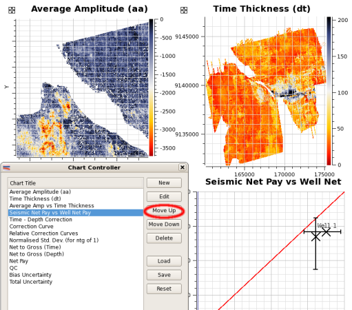
Moving charts is very simple. The table below shows an example of moving a chart within the chart area.
 .....
.....
The images in the figure above show how a chart can be moved.
The first image shows the "Seismic Net Pay vs Well Net Pay" chart selected. The SnpQt Main Window shows this chart in the bottom right corner of the display. Clicking the push button twice causes the chart to move up two positions in the Chart Controller dialog list. The Main Window is immediately updated with each click. The second image shows the "Seismic Net Pay vs Well Net Pay" chart in its new position at the top right corner of the display.
The push button moves the chart in the opposite direction.
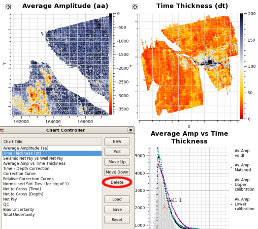
Like the other tasks described above, deleting charts is easy.
 .....
.....
The images in the figure above show how a chart can be deleted.
Just select the chart from the list and click the push button. The chart is deleted immediately without any warning, so you are advised to be careful when using this option. The SnpQt Main Window will update immediately to show the chart area with the deleted chart removed.
The left image shows the "Time Thickness (dt)" chart before clicking the push button with the right image showing the chart area with this chart removed. Note, the charts below the deleted chart move up one position.
Saving and loading the chart configuration is a powerful facility which allows you to view your session in many different ways. Chart configurations are saved in XML files. Only information about the charts are saved in such files. This facility also allows you to use chart configurations saved from previous sessions in other projects. Note, application parameters and information to reload data are not saved. The save sessions facility is designed for this purpose.
Use the Save button on the chart configuration dialog to save the current chart layout to a file. You will be prompted for a filename.
Use the Load button to load a previously saved chart configuration.
At any time you can use the "Chart Controller" dialog to save a specific chart configuration to an XML file for future use in this or other projects.
The chart area is divided into columns. The number of columns parameter allows you to control the number of charts that can be displayed in a chart row. This can range from 1 up to 30. The table below gives you an example of how this parameter is used.
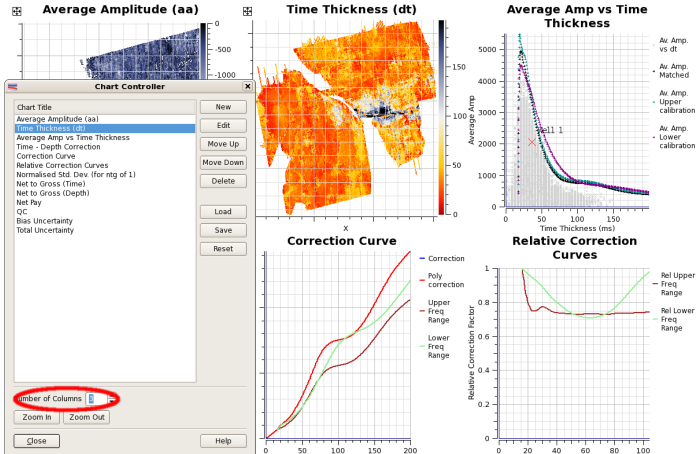
The images in the figure above show how the various charts can be laid out within the central chart area of the main window. The parameter which controls the number of columns can be found in the Chart Controller dialog. This dialog can be popped up by either clicking on the menu item or clicking the icon.
The Chart Controller dialog above shows the Number of Columns parameter set to 3.
The and push buttons perform the same functions as those described in the section entitled Global Zooming
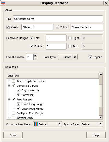
The Display Options dialog allows you to control what data is displayed in a given chart. The Display Options dialog will also allow you to change some chart properties including: Title (can also do this on the Chart Controller), the labels on the X Axis and Y Axis and Line Thickness. Currently, Line Thickness parameter controls the thickness of every data item on the chart. It is not possible to change the Line Thickness of an individual data item. The type of data, series, or grid, is controlled by the Data Type menu. The Display Options dialog can be popped up by clicking the Edit push button on the Chart Controller dialog or by MB3 on the chart and selecting from the pop up menu
The sub-sections below describe the various tasks that can be performed from within the Display Options dialog.
Changing chart titles, axes names and line thickness via the Display Data Items dialog is very simple.
The figure above shows how you can change title, x axis label, y axis label and line thickness.
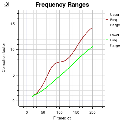
In this example we have changed the title to 'Latest Frequency Ranges'. As we edit these fields the SnpQt main window is updated in real time.
This is a very powerful feature which allows you to specify what data is to be displayed on a given chart. There are two types of data that can be displayed, Grid data and Series data. The following two diagrams show how the data items available change depending on whether grid or series is chosen.
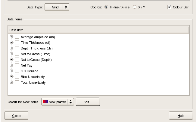
Grid data items correspond to those values that have a spatial extent. In SnpQt this typically refers to horizon based values. Coordinates can be displayed in either In-line/X-line, or X/Y.
When Grid data is selected for display then an optional Colour Bar can be displayed at the right hand side of the chart. The Colour Palette can be selected from the "Colour for New Items" menu and edited, if required, by clicking the Edit button.
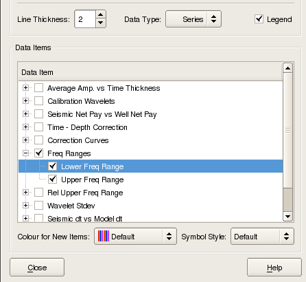
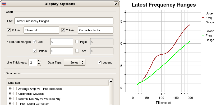
The figure above shows how you add and remove series based data items to a chart. Data items are assigned data label names and are grouped together into logical sets. The set (or group) name, together with the data label name, uniquely identifies the data item. So, for example, in the "Correction Curves" group the correction curve data items are named "Poly Correction" and "Correction".
Data items can be added to a chart by selecting the group name and the data label name within. The image above shows the "Display Data Items" dialog with the "Data Item" list displaying the "group names" and optionally the "data label name" if the group is open (ie expanded). Groups can be expanded or collapsed by clicking to the left of the group name. So, once a data item is selected for a chart, whenever that data item is available it will be displayed on that chart.
In the image above we have selected the data group labelled Freq Ranges. By default, both items within this group will be selected and added to the Frequency Ranges chart as shown in the following diagram:
At the time you select a data item for display you can assign a colour. Alternatively, you can allow a colour to be assigned automatically. The legend can be toggled on and off using the Legend tick box.
The Symbol Style is also under user control: to change the symbol style of a data item first remove it from the chart by un-ticking it from the Data Items list. Then select a new Symbol Style from the menu and, finally, tick the data item again when it will be re-drawn using the new Symbol Style. Each data item has a default symbol style defined by the application.
The data in a grid chart is displayed using a range of colours from a palette. To alter the colours that are used in a palette, click the Edit... button by the 'Palette for Displayed Items' selection on the Display Options dialog.
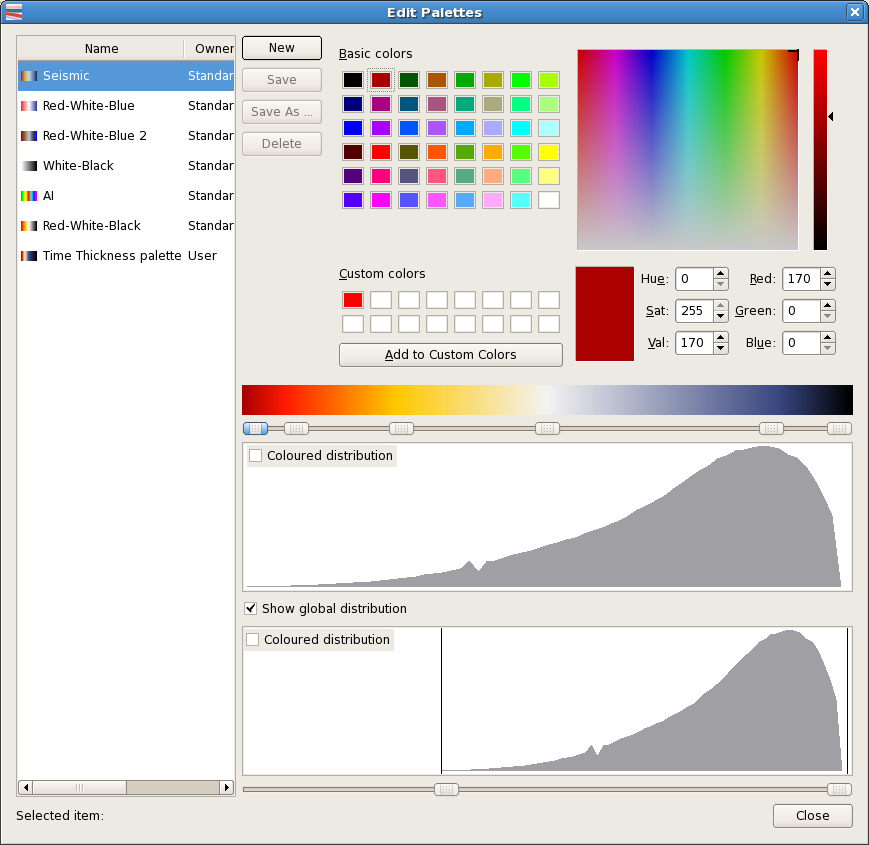
To select a palette of colours, select the palette name from list on the left hand side of the Edit Palettes dialog. Chart data will be redrawn immediately using the new palette.
Click the Close button to remove the Edit Palettes dialog
This can be done by either selecting and editing an existing palette or by starting from scratch.
If editing an existing palette, first select the palette as above.
To create a new palette, press the New button. A new palette will be created named 'New Palette'. This must then be selected in order to set up the colours that will be used for this palette.
When a palette is selected, the colours that are used for it can be set by using the sliders below the colour bar in the middle of the dialog. First, select a slider button. The diagram below shows the second of four sliders selected:
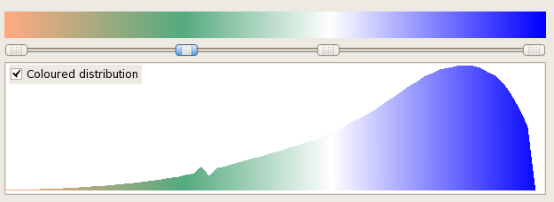
Note that unlike the previous diagram, the Coloured distribution checkbox has been ticked. This causes the histogram representing the distribution of data values for the chart to be shown in the palette colours rather than in grey.
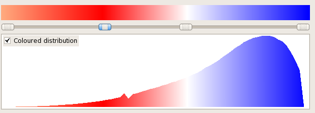
To change the colour managed by this slider, simply select a colour from the top half of the dialog. This can be done by either clicking a basic colour, or entering known rgb or hsl values. If a 'red' was chosen, the colour distribution would now appear as shown:
The slider can be dragged sideways to alter the data values that it affects.
To add a new colour into the palette, double click the line containing the slider buttons. A new slider button will appear and it's colour can be set as above.
To remove a slider, double click it.
An edited palatte can either be saved using the Save button or saved with a new name using the Save As...button.
Note that for palettes where the ownership is 'standard', 'Save As' must be used because these are system palettes that cannot be overwritten.
It will sometimes be the case that the bulk of the data points lie in a narrow range of palette colours. The range of data values covered by the palette can be adjusted using the Show global distribution checkbox.
The dialog will now display a second histogram. This has two sliders which can be used to adjust the range of data values covered by the histogram. It is good practice to adjust these as shown in the initial diagram of the Edit Palette dialog. However, the sliders can be moved to any part of the histogram and the effect seen as the chart data is redrawn.